What if we could end child marriages around the world?
Executive Summary
I teamed up with Sheefeni Hauwanga, a full-stack developer, to work on a brand new website for the nonprofit Too Young to Wed. We built a custom CMS platform and a new site to help showcase the client’s Pulitzer Prize winning photojournalism and tell the stories of the girls and women they rescue. Our work resulted in a new website that more effectively conveys the mission statement which helped increase donations and expanded their operations worldwide.
The Problem
Here’s a disturbing statistic: every two seconds, a girl somewhere in the world is married against her will. I worked with Stephanie Sinclair, a Pulitzer Prize-winning photojournalist who has dedicated her life to spreading awareness, meeting with village leaders and politicians, and establishing scholarships and providing relief in order to help young girls avoid this fate.
Her site for her nonprofit, Too Young to Wed, was on an outdated, broken version of Wordpress with an unintuitive custom theme and she was no longer able to get in touch with the original developer to update it. Even though the organization has impacted every continent, and had features in National Geographic, New York Times, NPR, and CNN, the old site did nothing to showcase Too Young to Wed’s accomplishments and accolades.
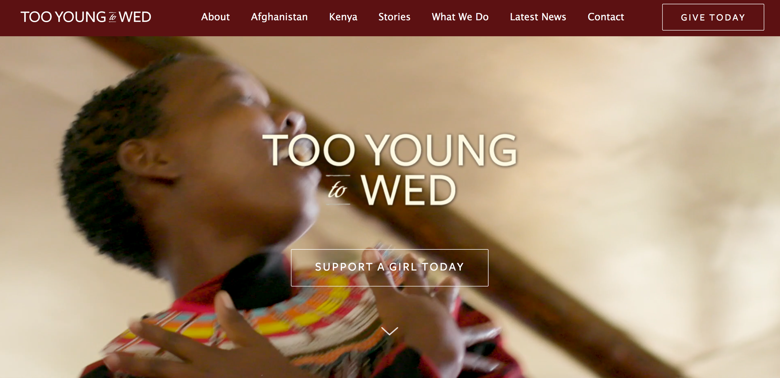
The Too Young to Wed site before the redesign
Evaluation of the site, compiling requirements
When assessing the old site, we found these issues:
Site did not clearly explain what the organization does or what initiatives they have worked on
Text was too small and had low contrast on some pages, which made it difficult to read
Site still used Flash and very clunky Javascript in some areas, resulting in areas not rendering properly
Navigation was off to the right side of the site but was difficult to read, hard to find at first
No mention of accomplishments or accolades
Showed client’s photography but not the stories attached to those images, which appeals to donors based on early user research
Site requirements:
I did this project in 2019 and it was the first time I had to write up requirements and user stories for the project. Before I did that, I conducted a discovery interview I did with someone who serves on board that donates to charities and organizations and assesses several nonprofits every year. The main takeaway from the interview was that the participant wants to learn about the credibility of the organization and the impact of their efforts.
A few of the top user stories:
As a user, I want to see proof and examples of the work Too Young to Wed (TYTW) has done to reduce child marriages so that I know the organization is credible and competent.
As a user, I want to know what my donation would be used for via learning about the organization’s programs, initiatives, and accomplishments.
As a user, I want to see the photos and read stories so that I can learn more about the issue.
“When my board reviews [organizations] to donate to, we’re mostly concerned about three things: can I trust this organization, how are they spending the money, and what’s the impact of their work?”
Showing impact
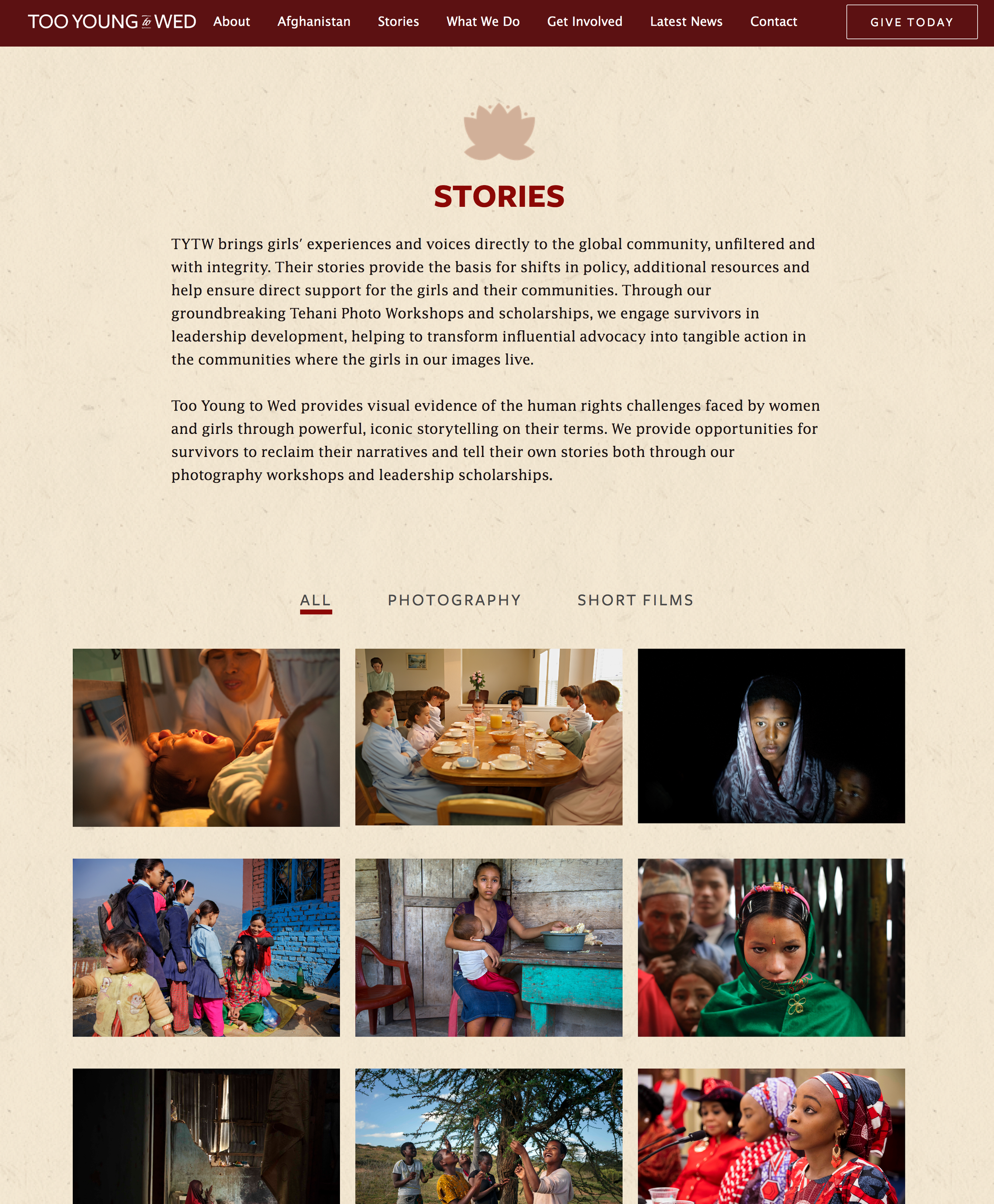
Stephanie Sinclair is a Pulitzer Prize-winning photojournalist, so it was a travesty that her old site was unable to show off her work. The old site featured her photography but didn’t give life to the context behind those images. Her work in sharing the stories of the young girls they helped drove a lot of donations at their live events, so we wanted a space for her to tell those stories on the site.
We took inspiration from other sites that had giant photography-driven stories like al Jazeera and Wall Street Journal. You can view some examples of the stories pages here:
“Hope,” featuring girls in Nepal
”Maternal Health,” featuring mothers in South Sudan
Project Management Lessons
This was my first time managing a project while also working on the designs. One of the challenges was that my client was not web development-savvy, so we had take her requirements, gauge impact and priority, come back with our assessment of what we can and can’t deliver based on the time and resources and explain the backend costs. Some takeaways from the experience:
Keep constant track of the initial requirements and maintain a record of decisionmaking. Not only did this keep us on track, it served as a north star for our decisions during production and gave transparency to the client on the status of the project items.
Always ask for the rationale behind the requirements. Based on the objective, you might come up with a better solution! This also helps with prioritization.
Keep assessing the outstanding items. More often than not, your initial estimate is going to be off because there were dependencies you didn’t consider or the stakeholders realize priorities have to be shifted. Keep looking back at them to ask, “Is this still the right priority level? Should we scrap this? Are our initial estimates on effort and impact still accurate?”
Outcome
In the end, we built Too Young to Wed:
a responsive site that could be viewed on mobile, tablet, and desktop
a customized admin interface so they can update the content
a digital space to showcase their award-winning photography and stories
a interactive map of where their programs take place
This was a big improvement from where they started with an outdated.
See the site for yourself
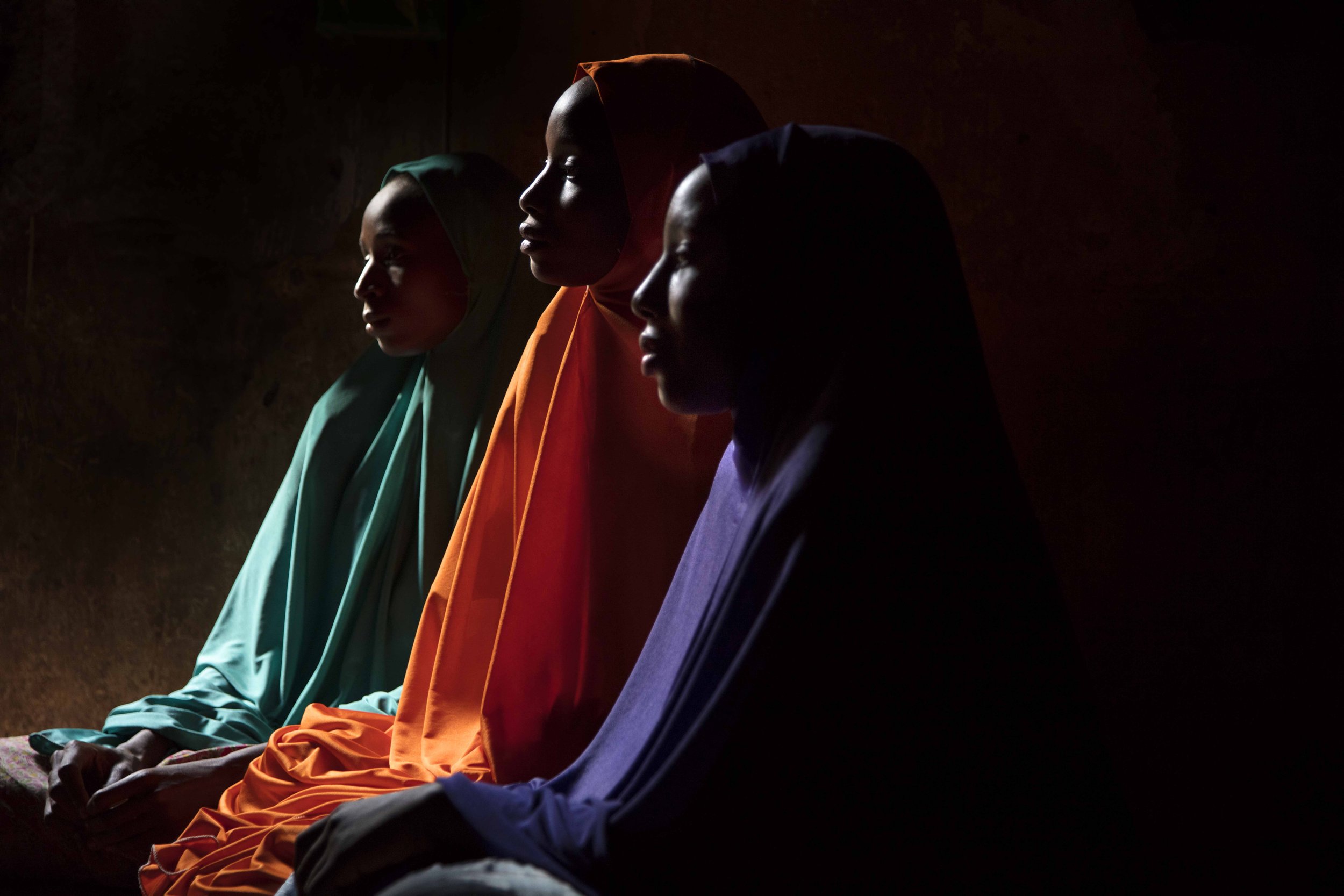
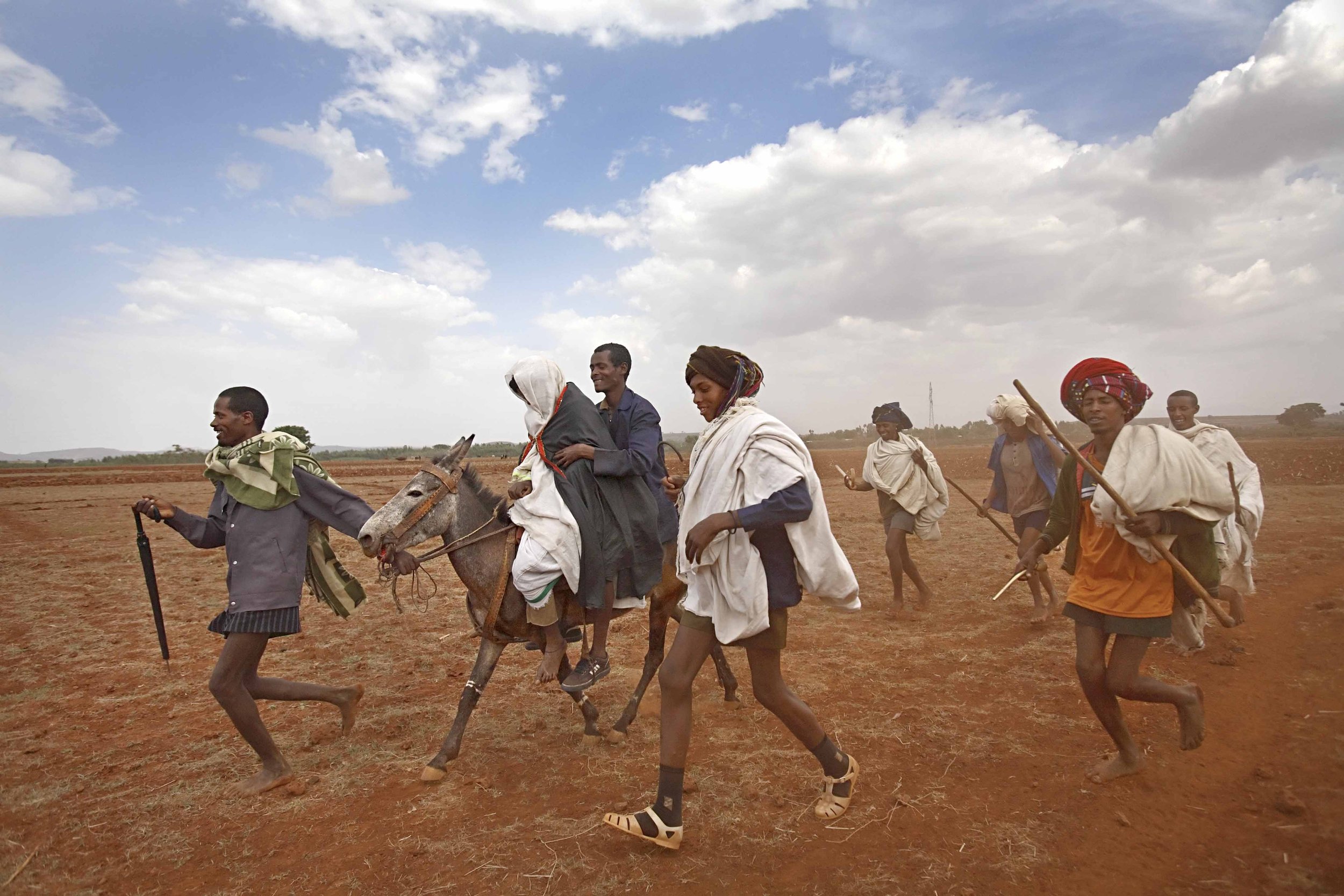
Also, check out the incredible work that Too Young to Wed does and consider making a donation! The photos featured in the hero image and here were taken by Stephanie Sinclair.
