How can we help customers through Cart & Checkout faster and improve conversion?
Problem
The company’s checkout system caused headaches for customers and there was a 30% cart abandonment rate. Key issues included bugs with shipping and billing inputs and unclear rewards and coupon processes. These problems resulted in frequent support calls. Not only that, the cart and checkout were not responsive! This part of the site had not been updated since the 2000s and over time, the web and mobile experiences were built on two different codebases, which made maintenance and adding enhancements multiply the development effort.
With competitors offering streamlined one-page checkouts as the industry standard, it was clear we needed a major overhaul.
Objective: Boost conversion rates and increase average order value.
Metrics: Targeted improvement from a 70% to at least an 85% completion rate.
What I did
As UX Lead for the cart & checkout redesign, I needed to uncover all the pain points, the functionality needed to facilitate the unique selling points that set the company apart from behemoths like Amazon, and bring modern patterns to the checkout to increase conversion and average order value (AOV).
But to do this, I had to work with a ton of different departments as different stakeholders owned Checkout, Rewards, Coupons, shipping, logistics, and Accounts. Checkout touched on so many different systems and I needed to coordinate all the different interests of each team to create an experience that was both profitable for the company and delightful to the users.
The Research
Usability Testing: Used Usertesting.com to get some preliminary usability feedback on the current checkout flow
UX Audit: The company hired a research firm to conduct an audit of our ecommerce site against 200 other ecommerce companies, my manager and I narrowed down the issues from the audit into the highest impact problems we needed to solve
Current State Mapping: I compiled screenshots of the checkout and set up stakeholder interviews with the Cart & Checkout product owner, the Rewards team, the Coupons team, Customer Support, and Engineering to uncover and rank current problems.
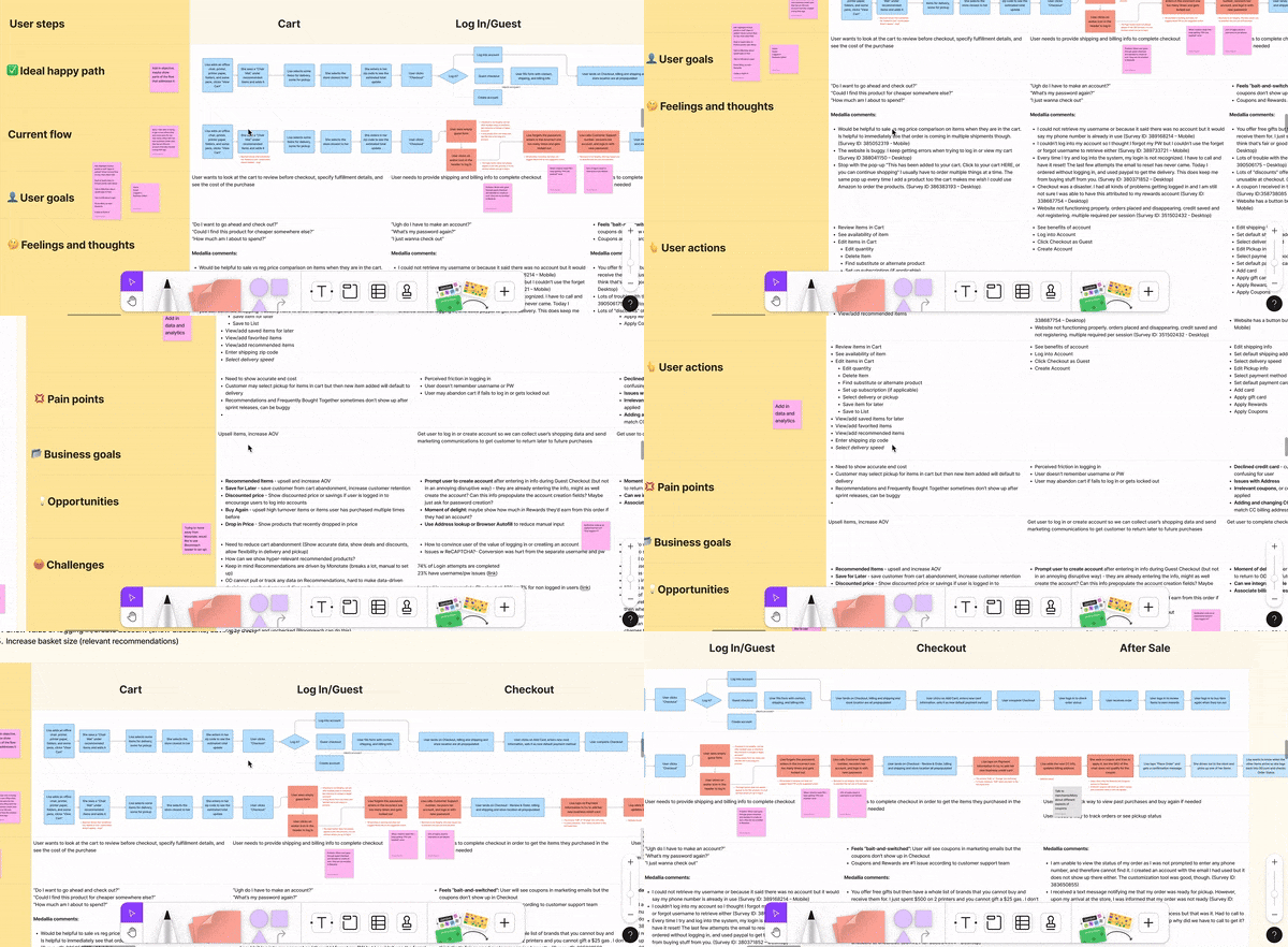
Journey Map: I took insights from my stakeholder interviews and compiled them all into a journey map so we could have an overview of the issues in each stage of the customer journey through checkout
Benchmarking: Analyze other big ecommerce sites like Amazon, Target, Wal-Mart, Macy’s, Wayfair, Best Buy for patterns around checkout, checkout login & guest checkout, Coupons,a dn Rewards.
The Findings
Customers feel bait-and-switched by coupons
Top complaints included confusion around rewards/coupons and difficulties with billing addresses.
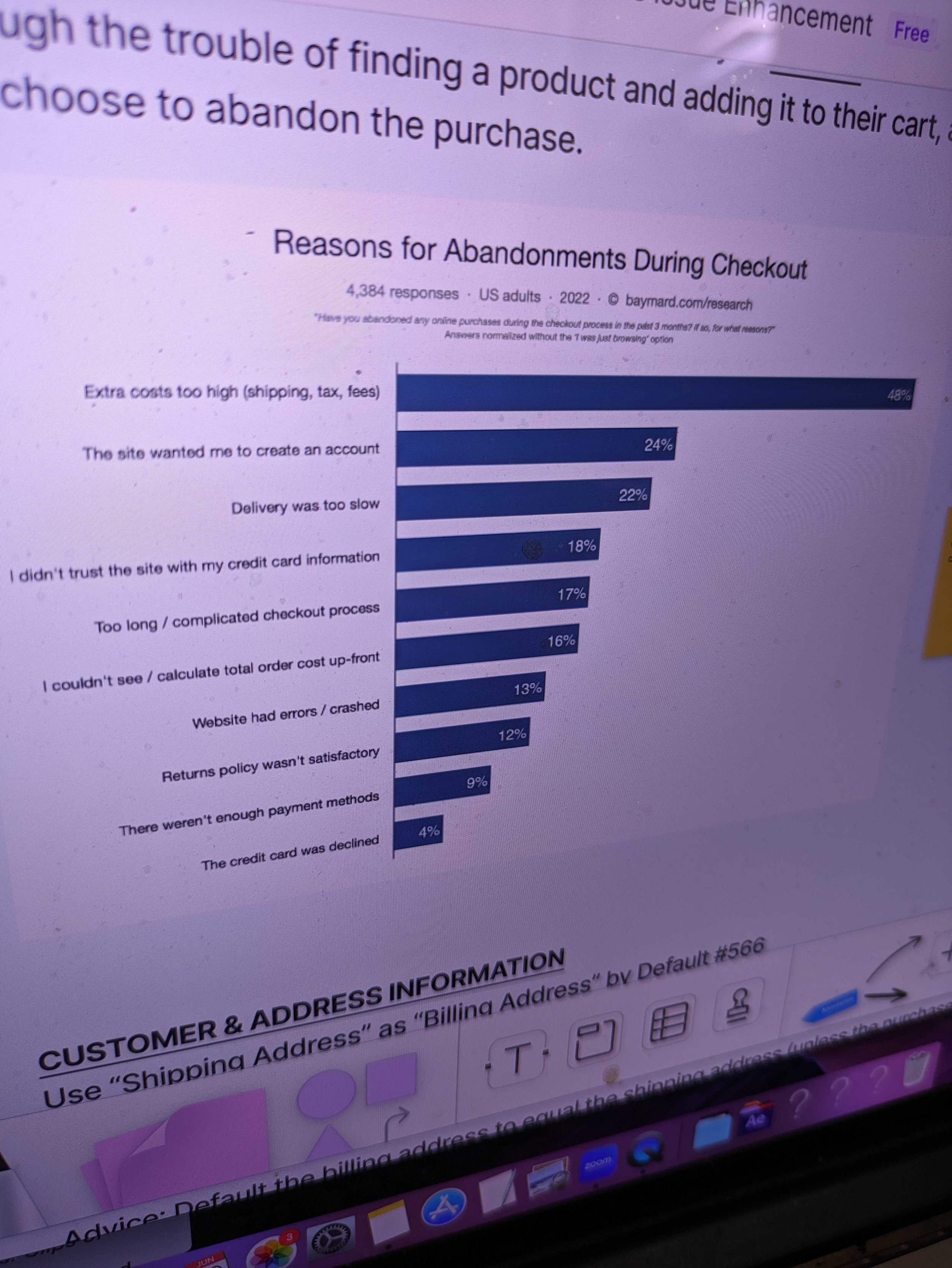
Even if guest checkout was technically longer, it is perceived to be shorter
Users found guest checkout easier, even if it took longer. Users have a high resistance towards having to create an account.
Lack of mobile optimization caused many errors in Checkout
Small touch targets, lack of inline error messaging
Billing address was attached to the account level instead of the payment method level
This caused bugs when customers tried to add a new card, they would miss the address or have to edit the billing address on account settings or they would set a new billing address, not realizing that it would change the default address on the account which caused issue for future purchases
Checkout is deeply intertwined with legacy systems
The billing address issue stemmed back to the early 2000s when the company used to invoice companies. There were a few legacy customers that still rely on this. The Checkout is also connected to several systems that facilitated shipping and logistics, inventory, and rewards. Redesigning the process was going to be a much bigger scope than we’d thought.
Invalid payment methods caused orders to go into limbo
This caused customer confusion since they saw a confirmation email yet the order was cancelled and customers missed the emails notifying them of the need to correct their payment method. This caused us to lose sales.
Pictured above: A journey map that I created from the stakeholder interviews to show the problem areas and the checkout flows before and after my recommendations
The Design
Design Changes:
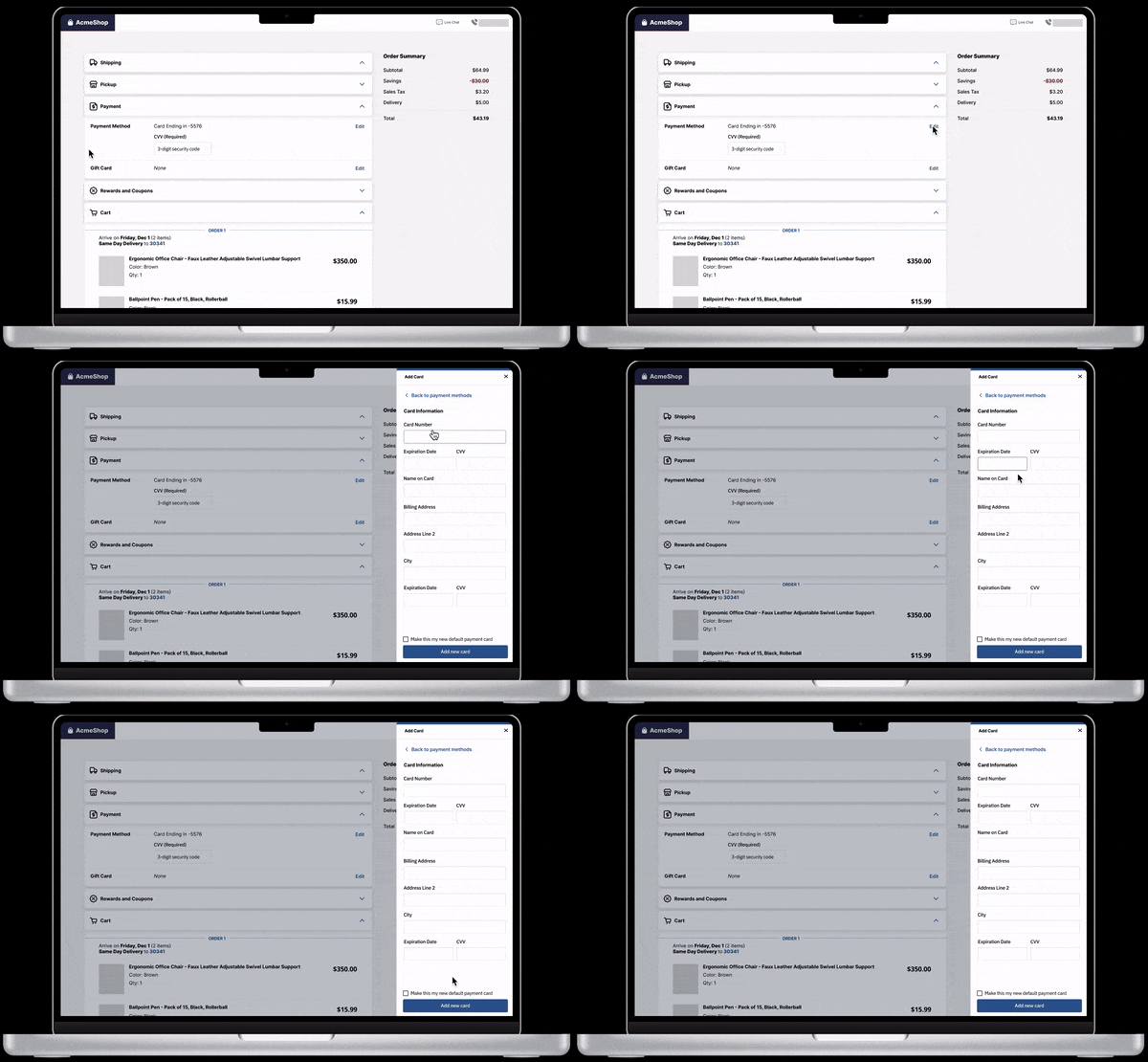
Responsive, Single-Page Checkout: Simplified the process by grouping related inputs and adding whitespace for better readability.
Customizable Billing Addresses: Allowed customization per payment method.
Clear Rewards/Coupons Application: Separated Rewards for clarity and auto-applied coupons based on user profiles.
Separated Order Items: Clearly delineated items that ship at different times.
Immediate payment Method Correction: tbd
Pictured above: Checkout pages have been consolidated into one page so users can easily edit shipping and billing info. When users click on “edit",” a drawer overlay pops up with the relevant fields for users to modify.


