Call Center Dial List
Could UI improvements help call center reps reach their quotas?
Problem
The interface was designed by engineers and sales. As a result, everything on the interface demanded your attention
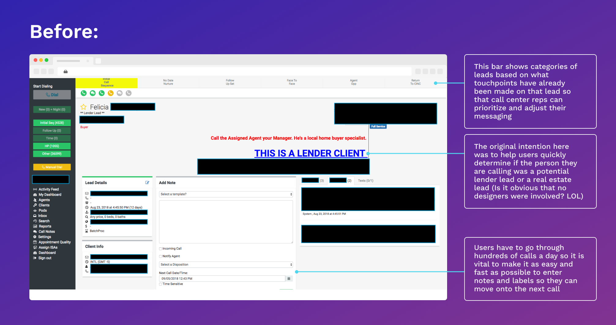
The software for the call center was designed by engineers and needed a re-design to improve usability and visual design. Every element seemed to scream for attention in neon HEX codes. In this contest, certain parts of the site were unnecessarily large, which ironically pushed 40% of the content down below the fold.
What the UI originally looked like … I can’t stress enough that this is the before pic 😂
The users needed this software in order to organize and prioritize their calls, follow ups, and call notes in order to nurture them and push them to sales.
Luckily, that was my first job right out of college.
Having worked as a call center rep before, this project was a perfect matchup for me.
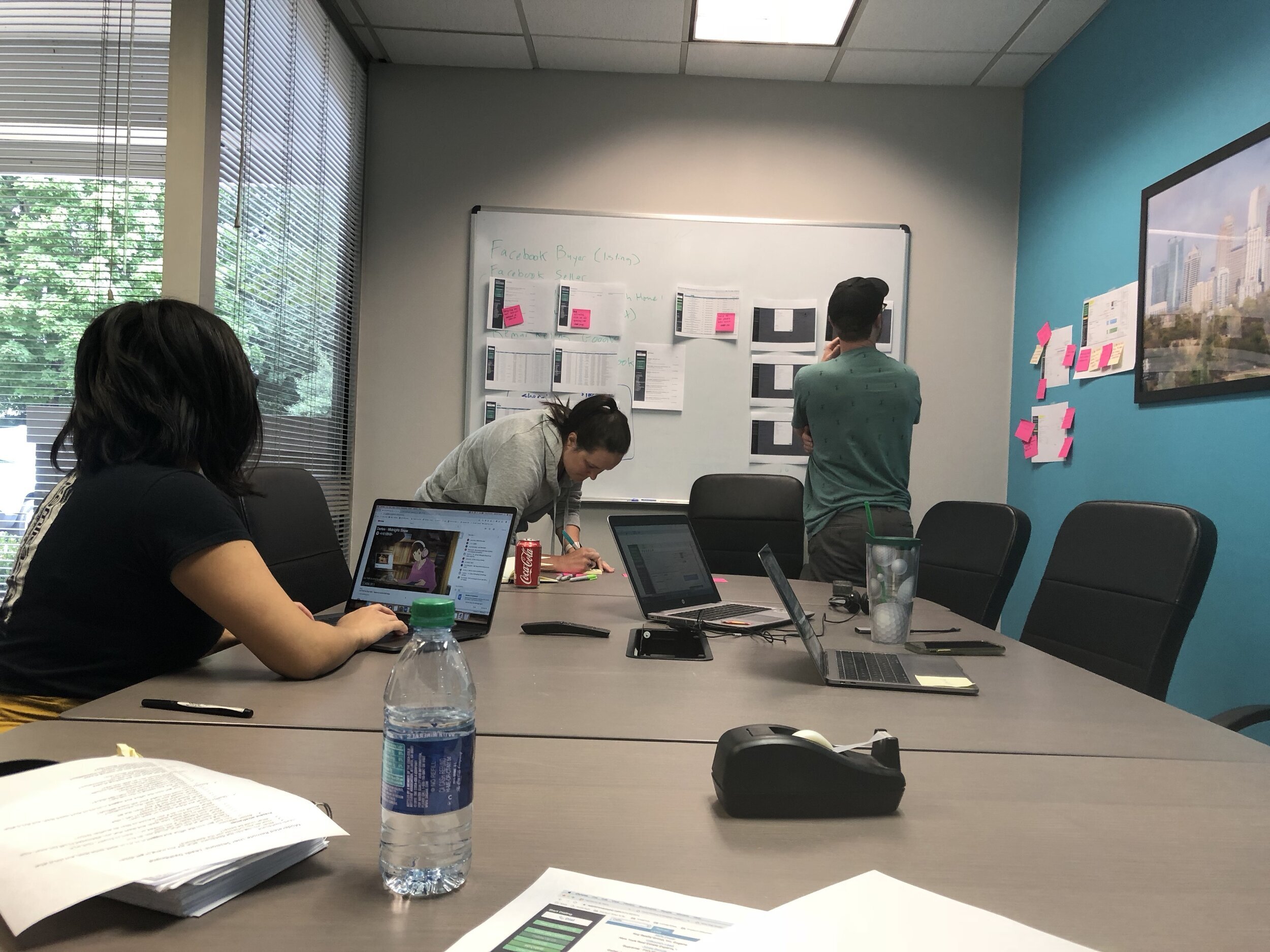
I knew about the nuances of the dialing process and I could empathize with the pressure of quotas. Using this previous experience, I also conducted a workshop to extract all of the user pain points with the current interface.
What I Did
Generative research, usability testing, prototyping
I conducted a workshop to uncover usability problems and product needs. As a former inside salesperson in a call center, I already had a mental “wishlist” of features that would have been so helpful back in those days. I also knew the pressures of quotes, the importance of call speeds, and pain points of incomplete notes, wrong numbers, and unorganized follow-up lists.
Of course, even though this was from direct experience, I still had to treat all of that as a series of assumptions. The 3-hour workshop validated 80-90% of those assumptions and uncovered even more issues that would have taken us weeks to uncover. I interviewed them, quietly observed the callers through field study, and had them put up post-its itemizing their grievances of the current UI.
The Solution
There were several design challenges, including:
Needed a dial pad so that callers can get through automated systems
Needed to see the client they were calling on behalf of and prevent the user from mixing up clients
Needed ability to see where the user was in their call queue
Needed the ability to add notes but also have canned notes so they can move onto the next call
Ability to see who else had talked to this person (when there is a disconnect, the lead got very agitated and it broke the credibility of the user aka the caller)
I addressed the top usability problems that I garnered through my own heuristic evaluation and the pain points that were repeated in the workshop and observed in my field study. The notes would pre-populate with a canned entry (“Left voicemail” made up 60% of the calls), which the user can just confirm or deny rather than typing it out or copy-pasting each time.
Another new feature I included was the reminder. Users had to personally track and set up follow-up, so clicking for the reminder eliminates that manual step. Setting these options rather than an open date picker reduces the cognitive load on the user.
High-fidelity mockup of the UI
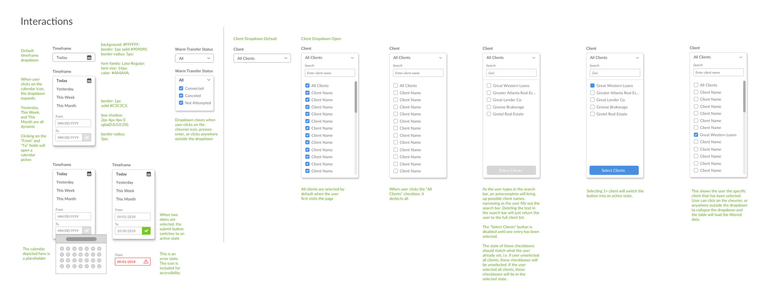
Annotations for how the timeframe, status, and client selection filters behave
Read More
My experiences in client solutions and a call center always make me head towards those departments first when trying to understand a process or product. Those departments are often on the front lines with customers and the product. They are the ones providing guidance, workarounds, and advice on the interfaces so they are an abundance resource of knowledge. Listen to my interview on UX Hustle with Sophia Voychehovsky Prater about it and read my breakdown of my Customer Service Workshops.


